Articles attempting to link Jungian typology to aesthetic preferences have always been popular, but unfortunately many of them are of poor quality, along the lines of “ISTPs like Bloodhound Gang and ESFJs like roses and rainbows.” With the help of a prior study by Joan Evans, D.Litt., we will nevertheless attempt to give an outline of the aesthetic preferences that usually follow a given function.
In doing so, however, we should not forget that Jung said in Psychological Types §895 that type portraits can never apply to all members of a given type. Likewise, Jung’s theory primarily says something about the cognitive functions and not so much about the specific psychic material handled by those functions. Aesthetic preferences are psychic material, not psychic functions. In other words, the relation of functions to aesthetic preferences is correlative at best.
CelebrityTypes’ editorial point of view is that da Vinci’s personal type is ENTP, but his aesthetic is used as an example of the Ti aesthetic in this article.
The Psychological Aesthetics of Ti
Written by the CT Admin Team, with inspiration from the work of Joan Evans.
Jung says of the Te type that he is dominated by logical thought and bases his life on a system of logical conclusions that spring directly from the facts – interpreted, if need be, through the generally accepted principles of his time. However, when we are dealing with the Ti type, the thought processes become subjective because Thinking is then no longer concerned with the actual object, but with the Ti type’s own idea of the object. As Jung says of Ti in Psychological Types §628:
“Facts are of secondary importance [to Ti]; what seems to it of paramount importance is the development and presentation of the subjective idea … standing more or less darkly before the inner vision.”
This tendency to abstract away from the actual object and towards the Ti type’s own idea of the object extends also to aesthetic matters. In regards to the arts, Ti types rarely experience any direct interest in the arts, but tend to experience aesthetic enjoyment as a background sensation instead. Other activities that are somehow associated with the the artwork may provide the Ti type with as much aesthetic pleasure as the actual experience of the artwork will. There is in him always a movement to submit the artwork to an intellectual regimen where it becomes the carrier of an idea which then holds the true importance to him. To the Ti type, then, we see that his intercourse with the aesthetic is above all an indirect endeavor – one where he can retain that same detachment and impersonal stance in regards to the aesthetic matters as is indeed his default in many matters.
With regards to the propensities of the Ti aesthetic, we find the following themes to be of central importance:
- An abstraction away from people and towards decoration and design
- A love of intricate curves that leads to the union of hard and soft; stiff and sleek
- A detached aesthetic appreciation, not being bound to the original artwork
We will now go over these in turn.
1. An abstraction away from people and towards decoration and design
Because the Ti type represses Fe, he tends to have a definite difficulty with anything pertaining to the interpersonal domain. At bottom, his sentiments have the same kind of strength and warmth as the Fe types; however, since Feeling is his repressed function, the Ti type has very little control of these sentiments, when to deploy them, and in what measure.
 In this way, the degree of control that the Ti type exudes over his sentiments can be likened to a music player where the volume can only either be set to ‘off’ or be set to play way too loudly. Finding that appropriate balance and strength of sentiment that comes so easily to the Fe types is a veritable nightmare and a perpetual source of awkwardness for the Ti types and so – while their sentiments may in fact be quite agreeable when they do show them – the Ti types will normally prefer to avoid having to deal too much with sentiment and feeling.
The interpersonal domain is his weakness. In it, there is no intellectually prescribed way to behave, and his main function is left at a disadvantage. For this reason, his main sources of inspiration in the visual arts tend to be landscape and decoration. In these fields he can retain an anonymity of feeling which is comfortable to him, as well as deploy his Ti to analyze the properties of line and design that must always be employed when dealing with landscape and decoration.
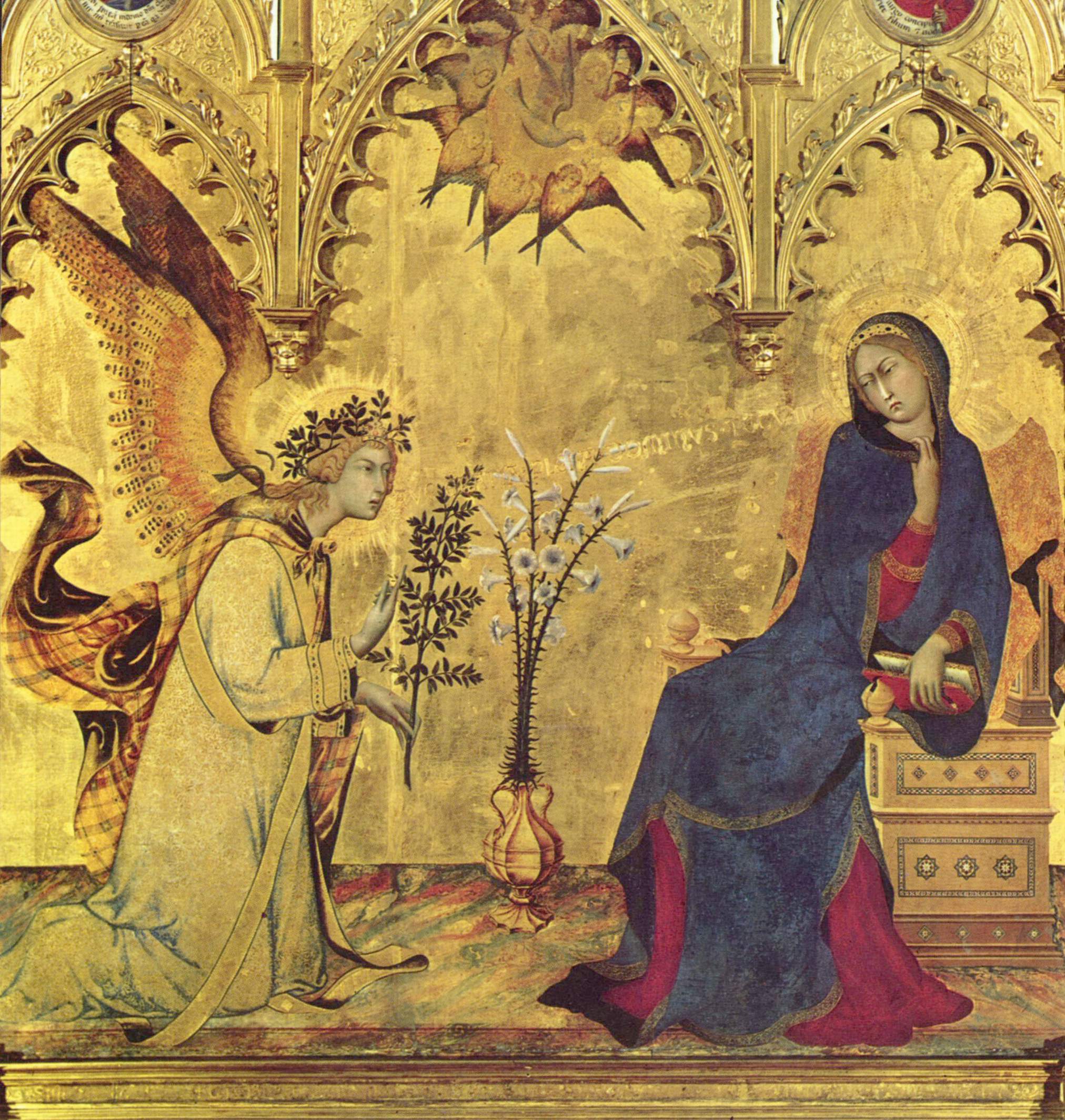
It is especially in the field of decoration, moreover, that the Ti type is free to experiment with curve, line, and form, which allows him to chase ideas rather than having to face the emotional evocations of the individual artwork. Notice, for example, this painting of The Annunciation by Simone Martini where the background decoration almost steals the show from the actual artwork, not to mention from the actual people in the artwork.
Indeed, looking at the work by Simone Martini, besides the obvious Gothic arches, we see how the real objects of focus are not the people but the Virgin’s inlaid throne, the many-sided metal pot in the center, and the intricacies of the branches and flowers, and we also see that the angel’s annunciation is actually carved into the painting itself, running in beautiful Lombardic script from the angel’s mouth to the Virgin’s head.
 Looking at the picture this way, we see that it is essentially the scene that is in focus, not the humans – it is a decorative scene with the human figures being almost incidental to it.
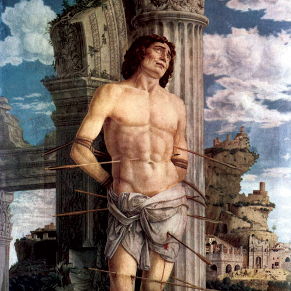
Sometimes the Ti type will venture even further down this path in his pursuit of the aesthetic and transform humans into something that is essentially decorative. He does this, in particular, by endowing his human figures with fixity and mass so as to make them appear as if made out of stone, iron, or marble rather than actual flesh and blood. The greatest example of this proclivity is probably seen in the art of Andrea Mantegna and the extreme rigidity and statue-like properties we find in his human figures.
And, likewise, note the extreme attention to background decoration that is present in the works of Mantegna. He would rather struggle to get the Roman columns just right, than he would focus his strength on the human figure or its expression of pain. Which brings us to our next point regarding the aesthetic of the Ti type.
2. A love of intricate curves that leads to the union of hard and soft; stiff and sleek
Above all, form matters to the Ti type in his appreciation of the aesthetic. An ingenuous curve may often mean more to him than a well-painted human figure. For the same reason, a sleek and intricate composition of design is more valuable to him than the heavy geometric regimes of the Te type. The conflict between the hard and angular “perfect” forms of geometry and the sweetness of a soft curve that unites the hard with the soft is a conflict that has raged for centuries within the field of aesthetics, but in modern times this conflict has played out especially clearly in the conflict between the aesthetics of Apple and Microsoft: One loves the intricacy of a smooth contour that relieves the eye while the other prefers the rigidity and schematic predictability of a sharp corner. In terms of psychological aesthetics, this is the conflict between Ti and Te.
Here it is important to note that the smoothness of the Ti aesthetic is not the pivot-less, free-flowing softness of the Ni and Ne types. Being a Thinking type there is still a definite commitment to form which can be seen no place more clearly in the fine arts but in the faces of da Vinci’s works. Looking, for example, at the faces of the Mona Lisa and the Lady with an Ermine we see that there is a definite movement towards the union of hard and soft. Soft lines are laid upon a hard form and sleek edges mildly obfuscate the rectangular form that is never the less obliquely there.
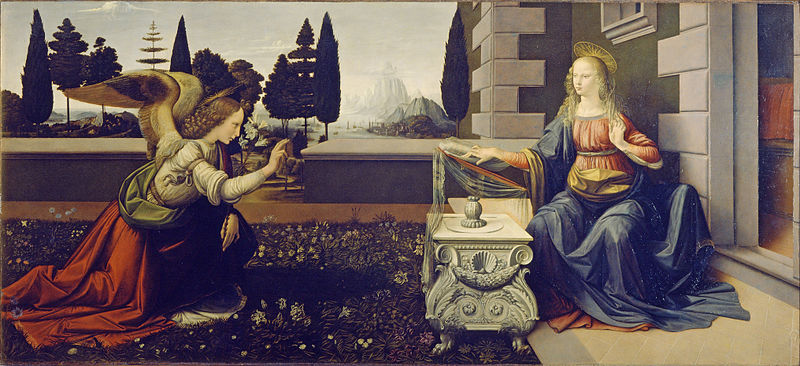 This same proclivity to wed the hard with the soft may be seen in the depiction of The Annunciation as attributed to da Vinci. Here the stone slabs in the background seem oddly soft and lightweight. Again they have that intricacy of form and curve which proposes to take us beyond the artwork itself and which leaves us with the impression that something more is going on with this artwork besides that which immediately meets the eye.
This brings us to our final point in our exploration of the Ti aesthetic.
3. A detached aesthetic appreciation, not being bound to the original artwork
As we have just said, the tendency to marry the hard with the soft produces in us a tendency to look beyond the individual artwork. It provokes our own imagination to think beyond, rather than making us submit to the aesthetic expressed in the artwork that stands before us. This same mechanism of going beyond can also explain the choice of color that is most often employed in regards to the Ti aesthetic.
With regards to colors, the Ti type usually prefers rich, glowing, and deep colors in his art and not earthen colors, like the Te type, or graduated colors, like the Ne type. Plain and light-handed color is not apt to please the Ti type and when left to his own devices, his colors are, above all, evocative.
Probably the best example of the use of evocative colors is found in the work of da Vinci, where there is always a certain elusiveness in the choice of color. With the evocative use of color, it is not the color that is the feature of the work, but rather (as Jung said) some dark, mental abstraction that one seeks to evoke before the mind’s eye. Another example of the evocative use of color is again Andrea Mantegna who in his youth was first neutral and undecided in his use of colors, but then he strengthened and increased the depth of his colors as he matured.
In other words, in both his choice of form, as well as his choice of color, the Ti type is apt to disentangle his aesthetic appreciation from the individual artwork, which leaves him free to pursue ideas and abstractions. It is also for this reason that the aesthetic of the Ti type is perhaps the most indirect aesthetic of all the types. It is not so much a direct enjoyment of the individual work of art, but rather a hovering background experience of the sublime. In this way, the Ti type’s enjoyment of the aesthetic may take on religious properties or become spiritual to him. In our opinion, this is what happened with Steve Jobs’ veneration for design; – design was something blissfully sublime to him and the public could plainly see it.
In music, the Ti type is bound to find instrumental work more enticing than the overt drama of opera and other vocal works, but unlike the Ne type, he places little importance on period instruments. He enjoys and is familiar with the classical idioms within his preferred genre, but he is apt to appreciate the free and ingenious use (and re-use) of them and to have a particularly keen eye for how leaps, twists, and turns on the familiar can be achieved with great effect.
For this reason, as well as because of his appreciation of works that unfold in a series, the works of Glenn Gould may be said to appeal to him, and indeed, he would agree with Glenn Gould that:
“[Art] is a process which is about process. It concentrates on process and one [should not] be seduced by the momentary attraction or distraction.”